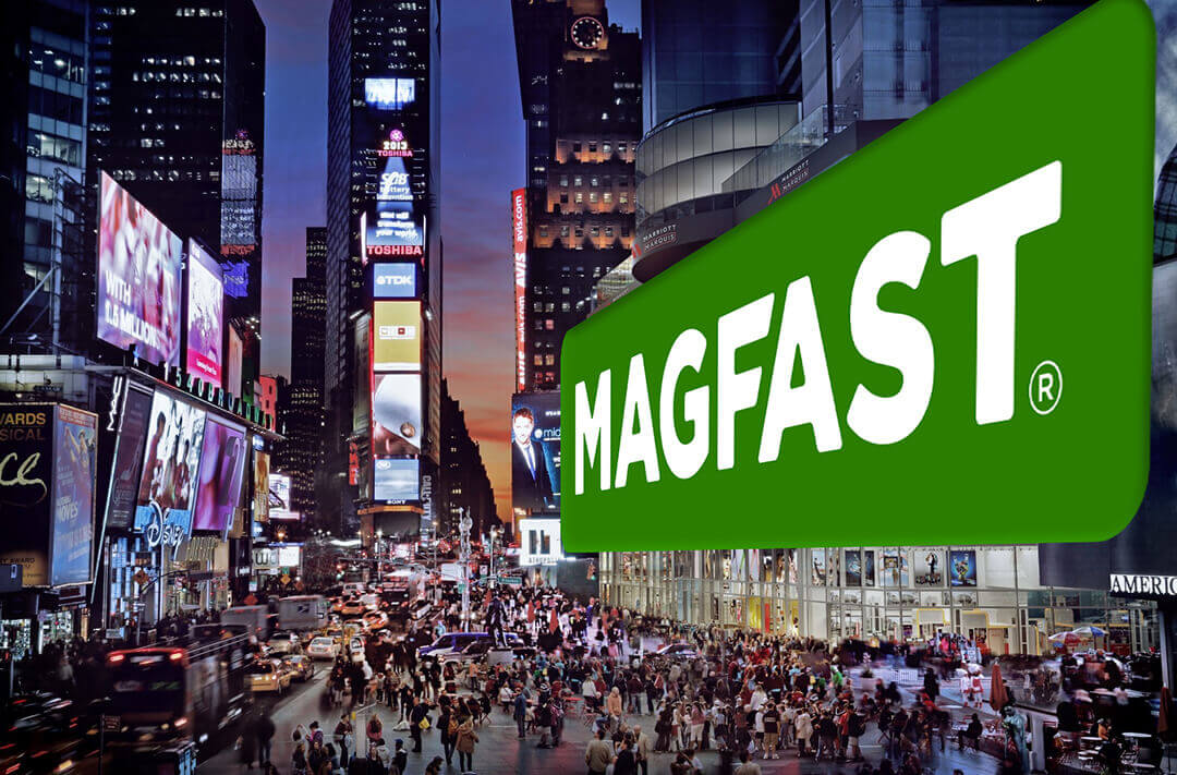
THE MAGFAST® LOGO
The MAGFAST® logo is the cornerstone of our brand. Please use it carefully and respectfully.

The logo needs a certain amount of space to “breathe”.
The more space it is allowed between it and accompanying text, images and graphics, the greater prominence of the brand.
Never crowd the brandmark in a way in which it is fighting for space, or too close to the edge of a page or spread.
Please allow at least the amount of space equal to half the height of the logo on all sides.
There are a number of variants available for use.
The Primary Logo
The primary, main logo, shown above is almost always preferred. It consists of a Green Wordmark on a MAGFAST Transparent ‘Plate’ so is named:
MAGFAST®-Logo-GREEN-Wordmark-TRANSPARENT-Plate-GWTP
WWGP stands for White Wordmark Green Plate and you can search on WWGP to find it in available formats.
Please always respect these rules for logo presentation.
Secondary Logo
It is preferred to use the GWTP (Green Wordmark on Transparent Plate) version – even if the ‘plate’ extends beyond its boundaries (as in the logo at the top of this page).
However sometimes this WWTP (White Wordmark on Transparent Plate) variant may be appropriate.
Other Variants
If you are working on a project where you feel one of the alternative variants would be appropriate, please click on the logo you want above to request access to source artwork.


